

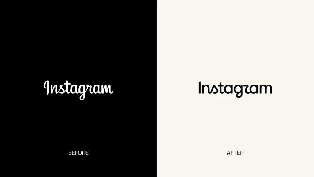
Instagram has introduced its first brand refresh in over ten years, updating its wordmark and the broader visual system that frames how the platform presents itself globally.
The new wordmark keeps the signature script that has long defined the brand but makes it bolder and simpler. The design team explored hundreds of directions, including all-caps treatments, camera-based concepts, and literal handwriting, before returning to the script format.
“Script reflects individuality, so referencing that felt right. The new wordmark is bolder and simpler, with touches of unexpectedness. It cues individual expression, a personal voice, both of which have always been core to Instagram,” Jasmine Probst, Instagram’s Director of Product Design said in a statement.
Beyond the wordmark, Instagram has updated its wider brand system. The gradient remains, but it appears more sparingly alongside refreshed motion, layout, and UI treatments.
The company has also introduced three new typefaces: an updated Instagram Sans, a handwriting-style Instagram Pen, and Instagram Mono. The aim, according to the team, is to give the community’s content more room to breathe rather than competing with platform branding.
May Hartono, Director of Brand Design at Meta, described the intent: “The refreshed brand system puts our community’s creativity and self-expression front and center. It’s designed to spark courageous action and give people the confidence to create and show up as themselves, freely and fully.”
The new wordmark is rolling out globally now, with the full brand identity continuing through 2026 and beyond.